
23.4.09
26.3.09
3.2.09
25.11.08
movie poster assignment
Here's my movie poster for "The Paranoia Perspective," a finger-puppet murder mystery.


28.10.08
dvd menu assignment: phase one
For our next assignment, we're to create a working dvd menu. The first part of this task was to make the background image and buttons we'll be using in our menu.

From the feedback I received, I think most of my classmates felt the layout was well balanced and easy to understand. Most, with a few exceptions, liked the use of color, though some thought too much color was used and others thought too much black. Many felt that the font (Helvetica) was too simple/bland. Some noted the cropping of the two squares in the bottom left corner.
For the final project, I plan to rethink the color scheme, create a custom typeface for the titles, and eliminate the cropping of the two squares in the corner. I'd also like to think of a better title.
9.10.08
opening credit sequence assignment
For the opening credit sequence assignment, we must present an analysis of the opening credit sequence of a film or television show of our choosing. We are to analyze the sequence's usage of typography, spacing, color, visual effects and audio to determine its meaning and overall effectiveness.
The opening sequence I have chosen is from a short, Japanese, animated film called Cat Soup (Nekojiru-so). The sequence effectively uses a simplified color palette and visual style as it follows a trail of kitten's footprints from a straight aerial shot, with the credits interspersed along the trail. The footprints and the credits are black on an off-white background, giving the impression of ink on rice paper, the credits distinctly stylized, appearing handwritten with a brush. The use of audio is also interesting and effective. Over a light, optimistic theme song, sound effects are used to evoke the journey of the footprints' source. For example, at one point the trail of kitten's footprints is joined by that of a chicken; here we are able to hear the chicken clucking and strutting. The clucking becomes frantic and frenzied and the trail of footprints is suddenly littered with chicken feathers. From here, the kitten's footprints continue, the chicken's do not.
The opening sequence I have chosen is from a short, Japanese, animated film called Cat Soup (Nekojiru-so). The sequence effectively uses a simplified color palette and visual style as it follows a trail of kitten's footprints from a straight aerial shot, with the credits interspersed along the trail. The footprints and the credits are black on an off-white background, giving the impression of ink on rice paper, the credits distinctly stylized, appearing handwritten with a brush. The use of audio is also interesting and effective. Over a light, optimistic theme song, sound effects are used to evoke the journey of the footprints' source. For example, at one point the trail of kitten's footprints is joined by that of a chicken; here we are able to hear the chicken clucking and strutting. The clucking becomes frantic and frenzied and the trail of footprints is suddenly littered with chicken feathers. From here, the kitten's footprints continue, the chicken's do not.
typography assignment
For our first typography assignment, we were given eight phrases to expressively render in Photoshop. We were limited to a white background, and given several requirements, such as the usage of tracking and kerning, photographic fills, and Photoshop filters. Within these parameters, we were to render the phrases in a way that would express their connotative and denotative meanings.

For this phrase I decided to use a custom type-set (created using polygon and rectangle select tools). Since the three words were roughtly the same proportionally, each starting with V, ending with I, containing four letters, I decided to stack them. First I made the base shape, a rectangle, and designated it to an alpha channel. Within this rectangle I created the VE and VI blocks. I used the same rectangle to create the N, the D and the C. I then used the rectangle select tool to recreate the I from the VI blocks in a complete form, and used the circle select to make the dot. Finally I inserted symbols into the dots to express the meaning of each word: a star for "I came" (representing a point on a map), an eye for "I saw," and a fist for "I conquered."
 This phrase was created using a preexisting font, followed by a series of filters. First I used the Distort-Twirl filter repeatedly, back and forth, to give the letters a somewhat warped appearance. I then added noise and glowing edge filters. I then selected each letter individually and moved it into place, moving conventional closer together and wisdom further apart so that the two would be equal width. Finally I added the lines and used the same series of filters.
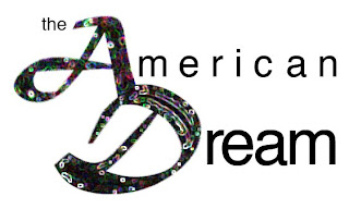 For this phrase I used a large, elaborate script font for the A and D, then connected the two into a sort of logo, and used a similar set of filters to the conventional wisdom image. I then used Helvetica in three different sizes for the, merican, and ream, tracking and kerning the latter two so that they would share a right alignment.
Subscribe to:
Posts (Atom)

